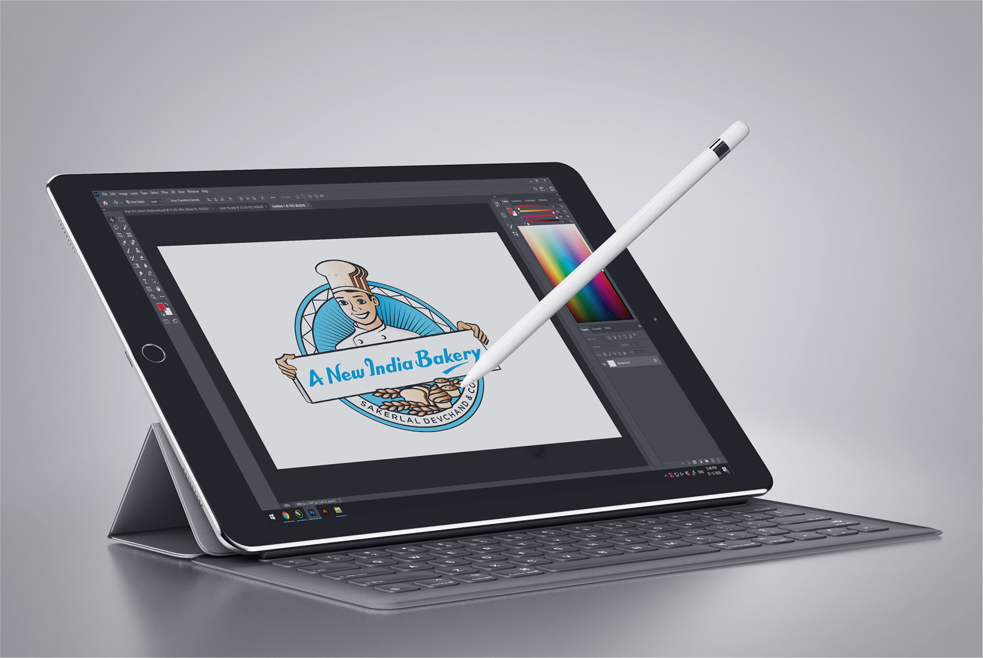
We were advised by the client not to reproduce anything new to the typeface of the brand name for this mascot project because the typography designed represents the emotions of the client's grandfather when it was created by him. The main challenge for us was to build something that echoed the typeface, which was large in size and character.
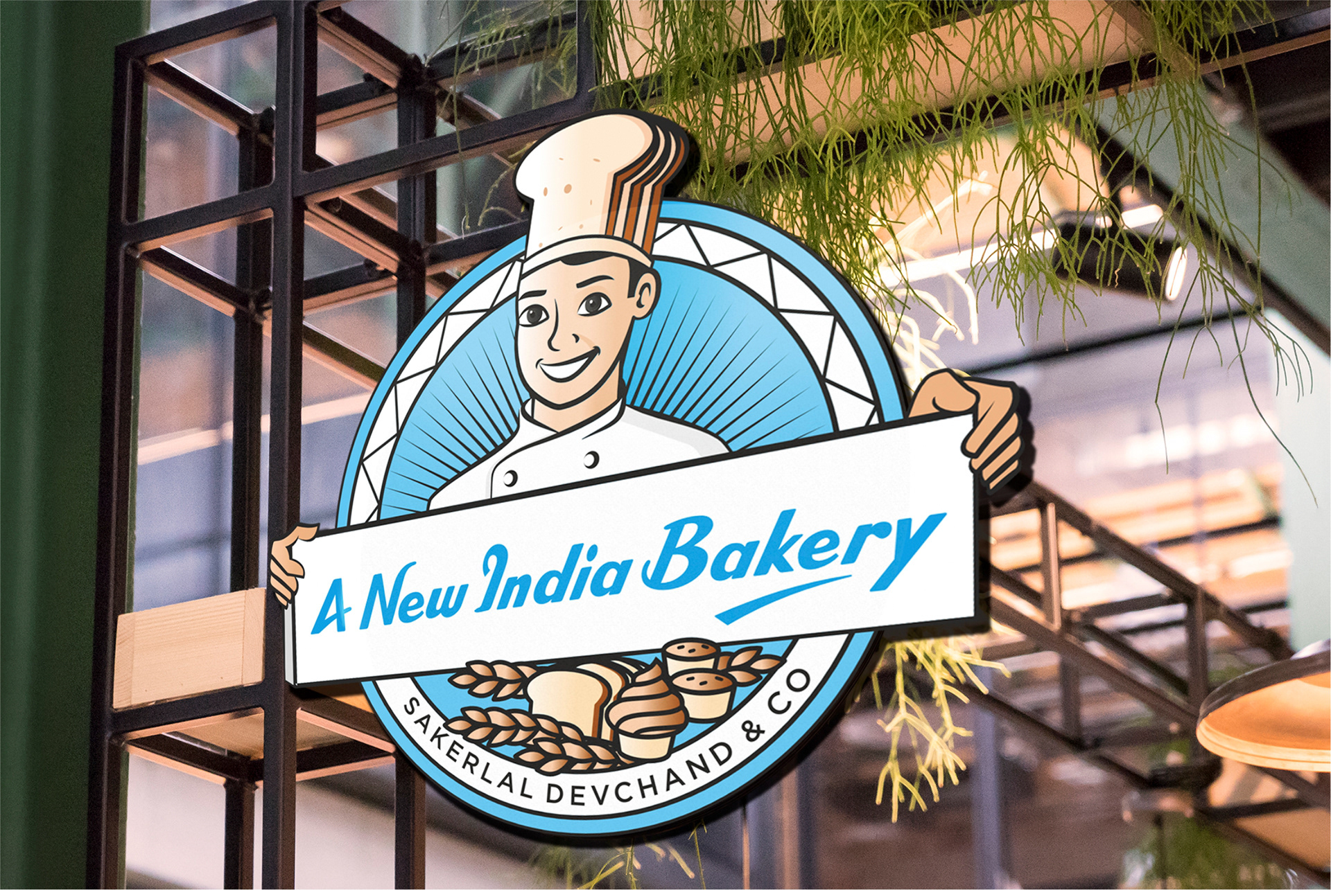
Since the client has a well-established business in Surat, we thought it would be great to incorporate a touch of Surat city inside the bakery emotion with small elements, which is why we thought of merging the brand this way.
We focused on several aspects of composition so that it can reveal the tale of a bakery brand in Surat with just a glance.
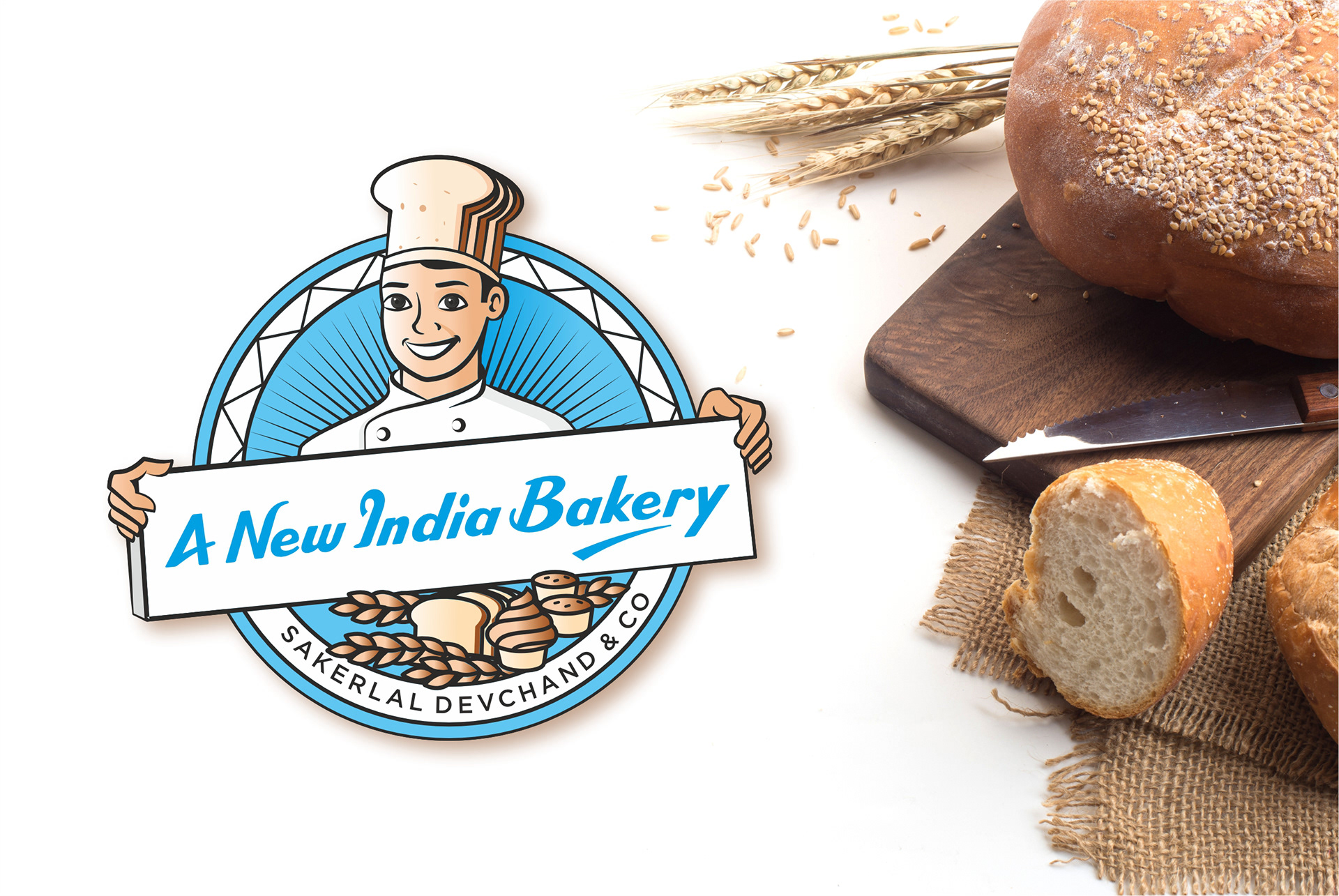
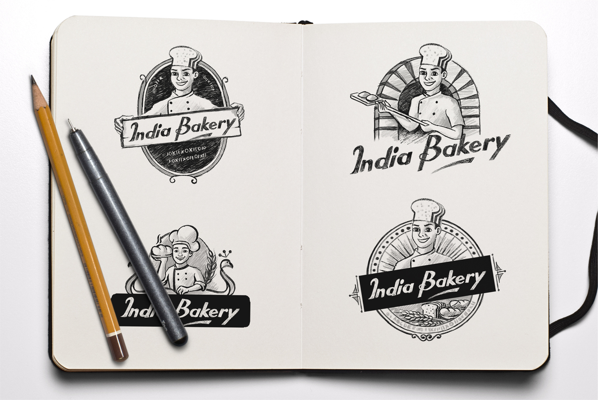
The chef cap is made of bread, which subconsciously conveys the impression of baking goods while still emphasizing tasty bakery delicacies. Many explorations were considered, including trying the mascot to a traditional artefact to demonstrate that this brand has been trusted for a long time. At the same time, it has the feel of a traditional bakery process, with the chef serving handmade goods with his oven shovel, and for one choice, a peacock is highlighted to add a sense of belonging for the nation.
The chef cap is made of bread, which subconsciously conveys the impression of baking goods while still emphasizing tasty bakery delicacies. Many explorations were considered, including trying the mascot to a traditional artefact to demonstrate that this brand has been trusted for a long time. At the same time, it has the feel of a traditional bakery process, with the chef serving handmade goods with his oven shovel, and for one choice, a peacock is highlighted to add a sense of belonging for the nation.
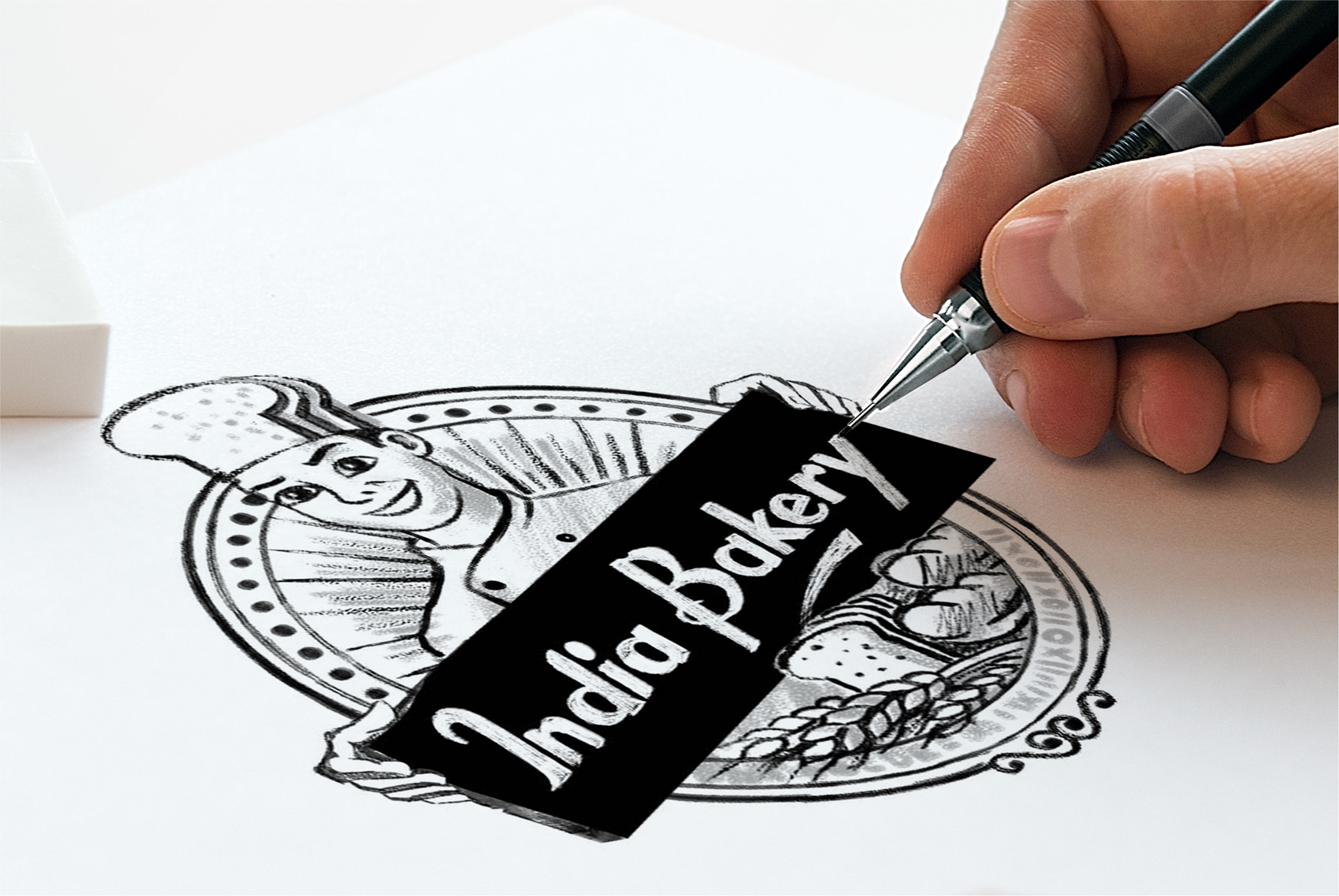
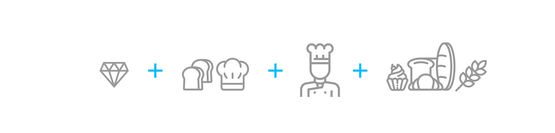
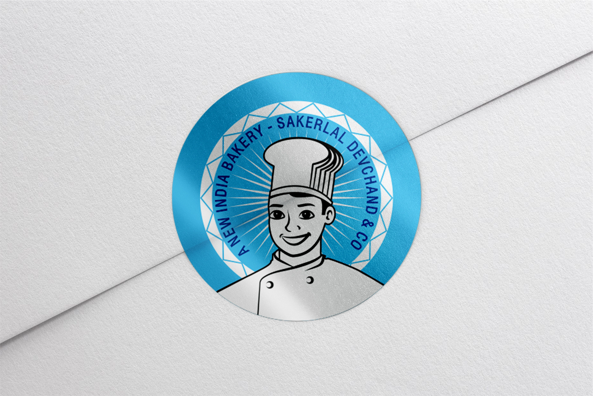
The final mascot represents the concept of a bakery brand, which is elevated by a young generation continuing the legacy of the bakery brand, which is metaphorically empathized by a chef cap made of bread. It also has the brand's subject matter, which are delicious bakery servings. The mascot's background reinforces the fact that Surat is well known for diamonds and represents the top structure of it.