Kick-starting growth through rebranding efforts requires more than a logo change and new wall colours.
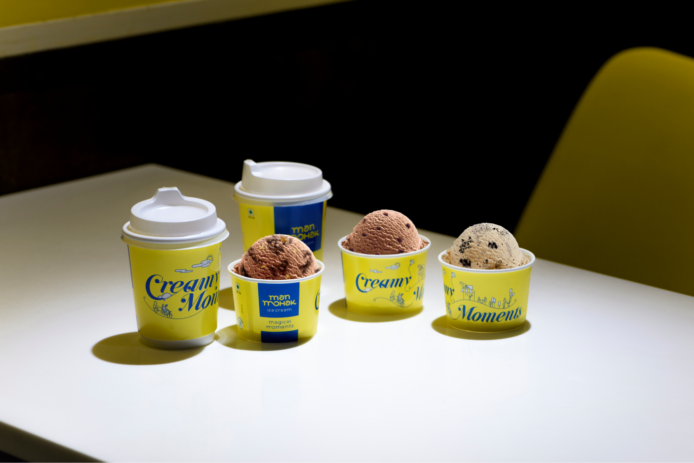
We helped Man Mohak in adopting a new brand image in a bold way to increase consumer interest, excite prospective franchisees, and spark internal enthusiasm. While the product range remained the same, we created a definitive shift in overall brand messaging.
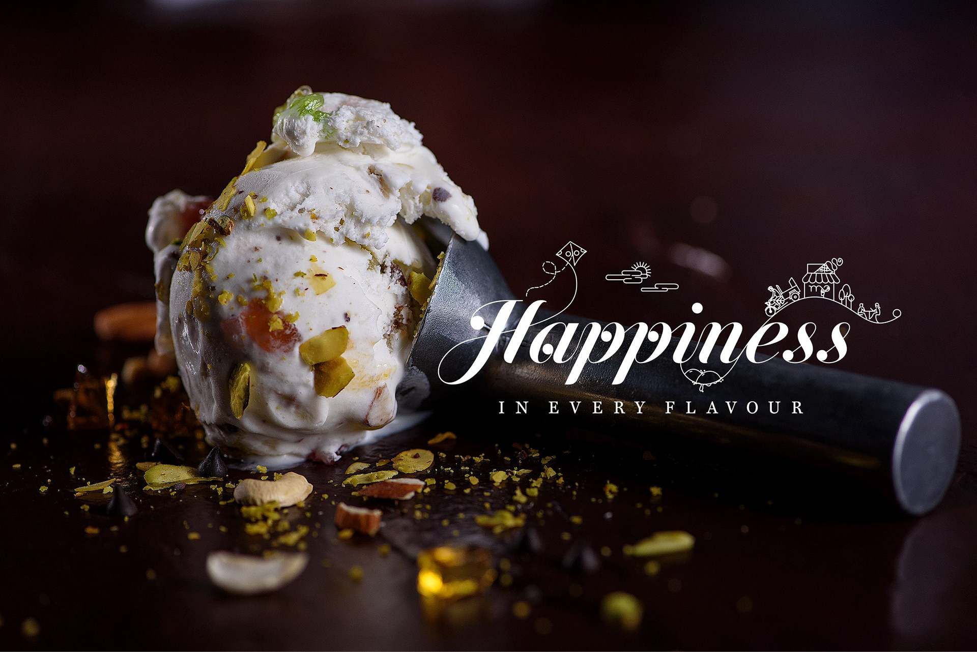
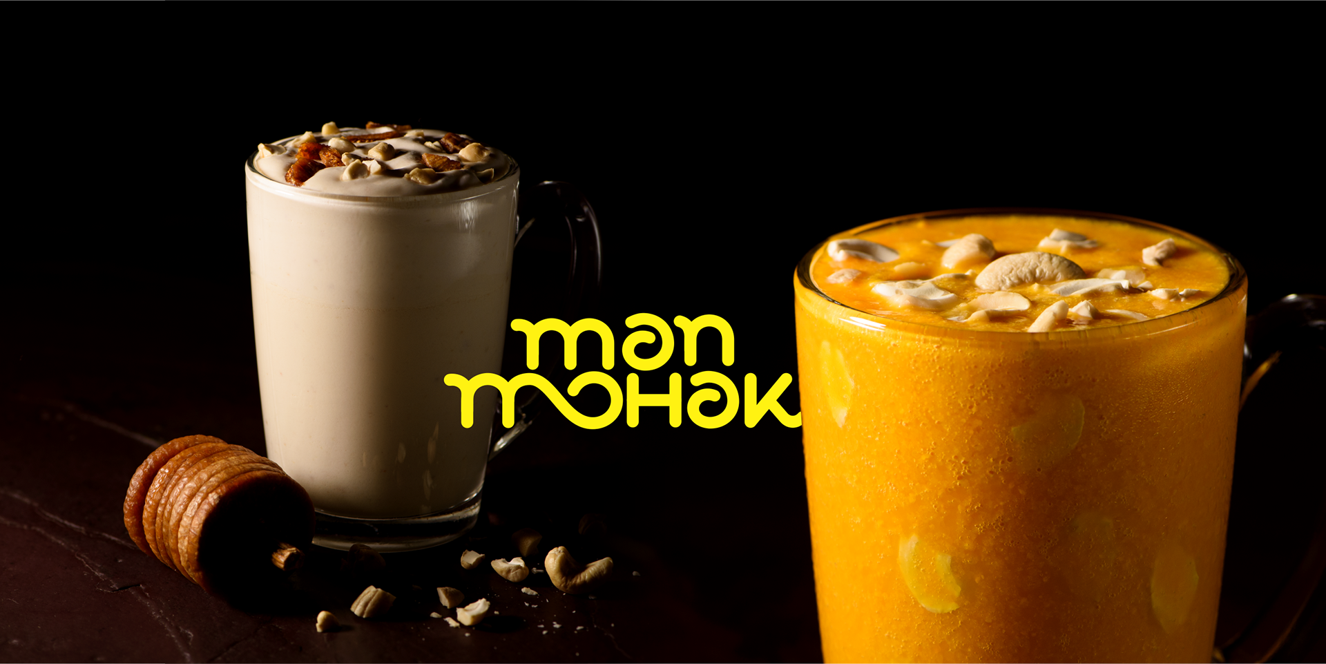
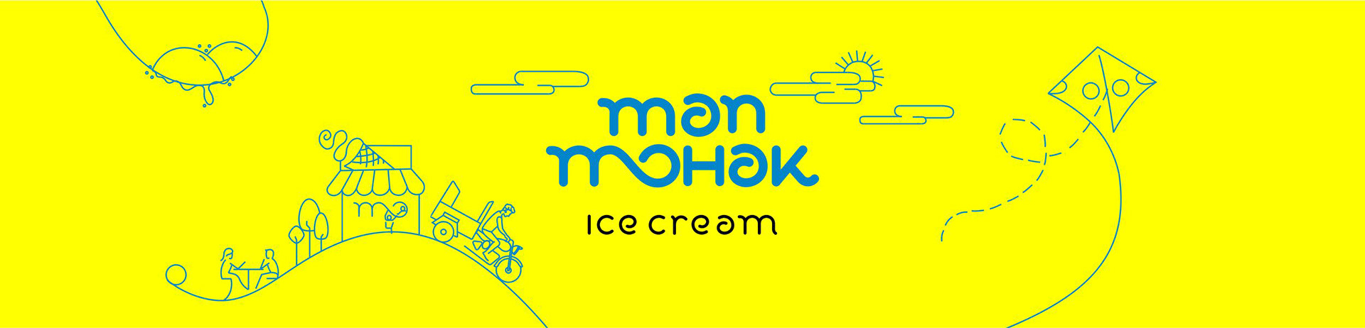
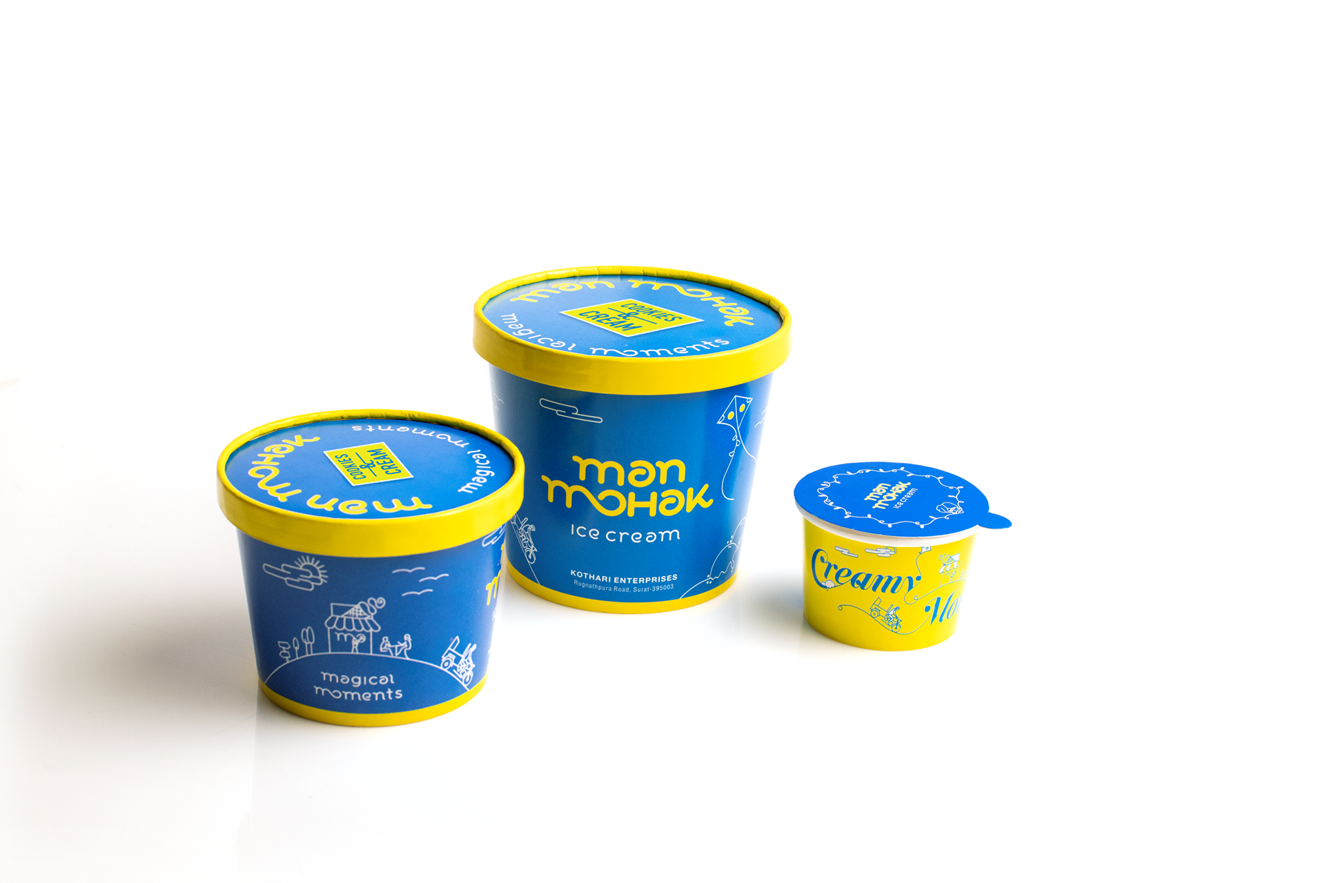
Man Mohak’s brand makeover focuses on culture. The initial research showed that Man Mohak was valued as a traditional Ice Cream brand with appreciation shown for its unique ‘Kothi’ ice-cream. Based on this insight, we created a Brand Language, which though bright and modern, harped on the ‘desi’ elements of Gujarati Culture that have become the core of its brand visuals, eg. A Chagdo rickshaw, famous Gujarati festivals like Navratri & Kite Flying, and a characteristic Gujarati Milk-man, etc.
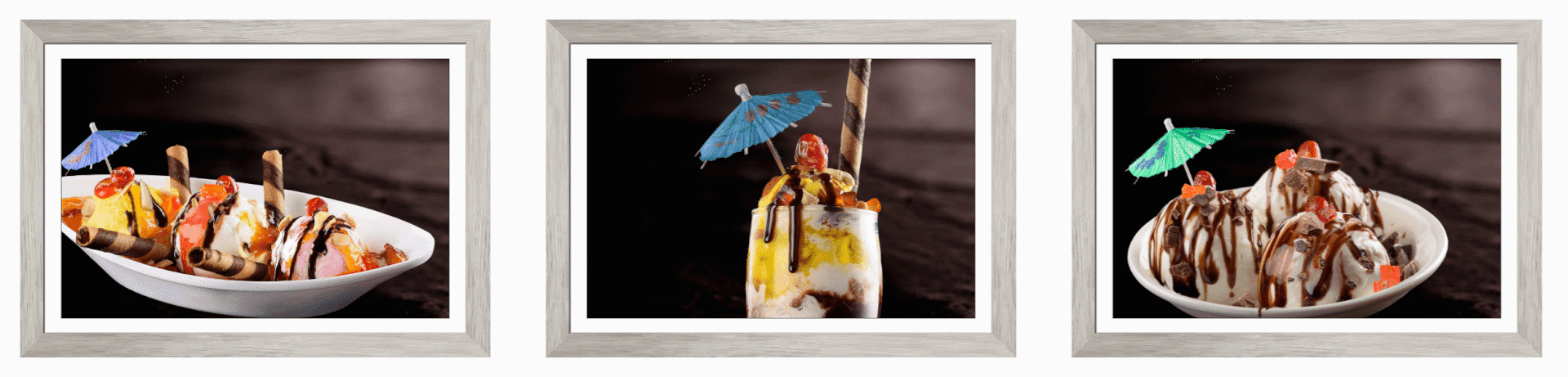
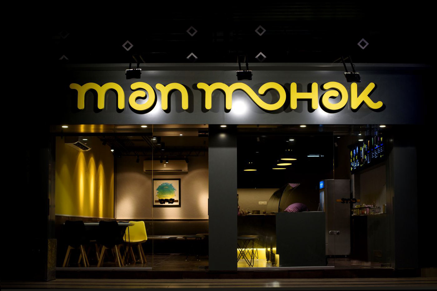
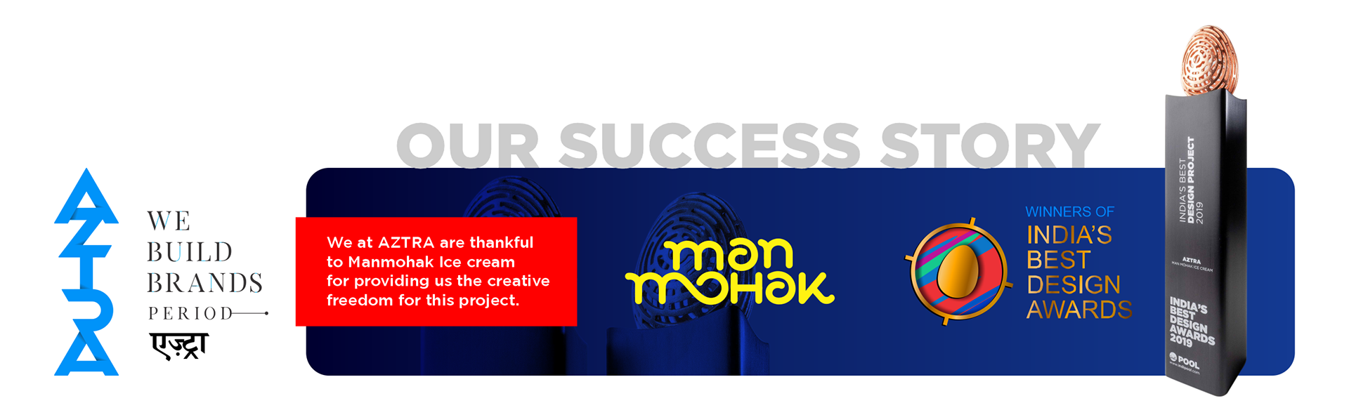
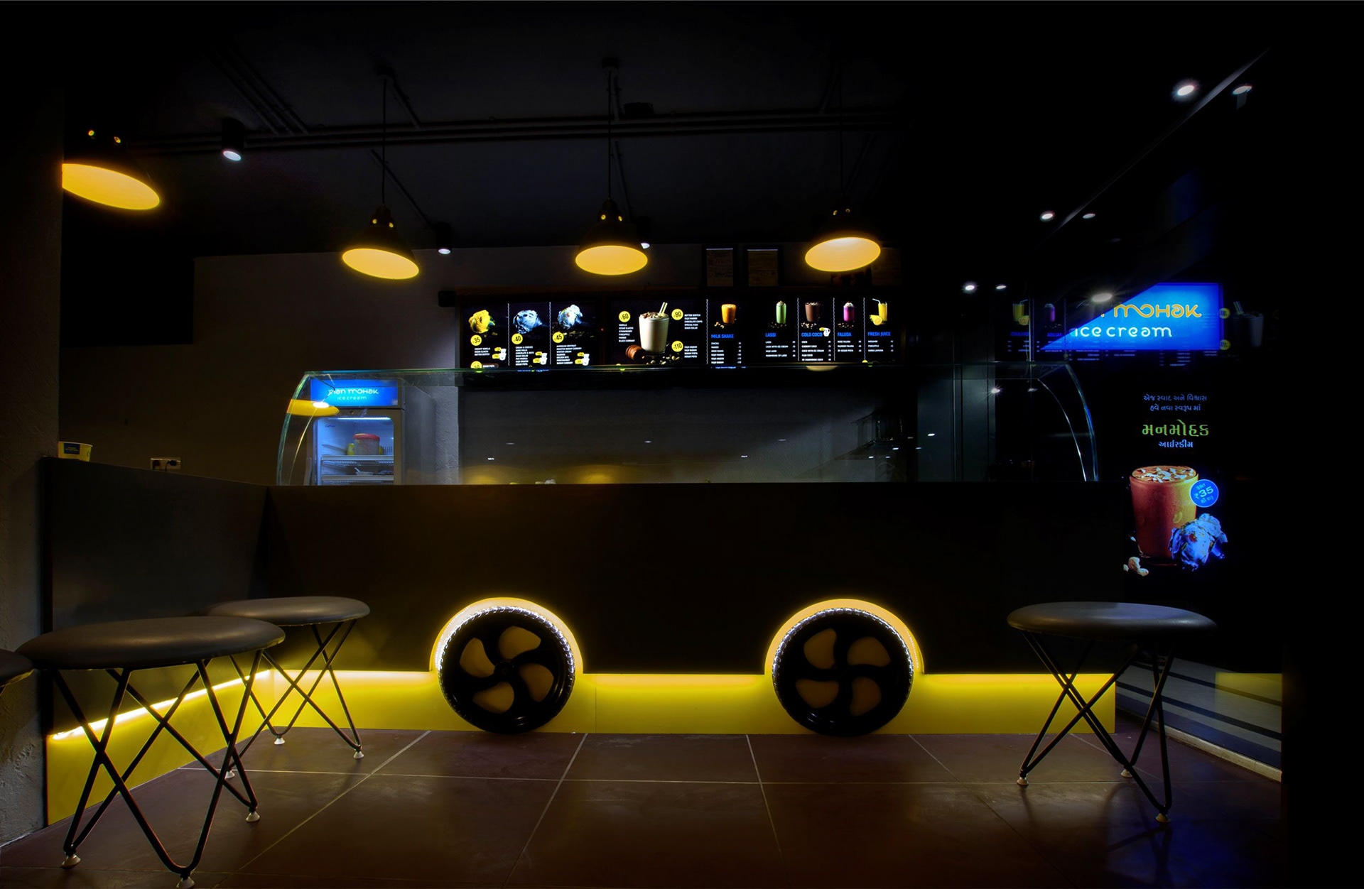
We have executed an end-to-end brand solution for them, right from crafting its new Brand Identity, to its Product Shoot, to In-store Branding, to Advertising. We have partnered them in creating a unique ‘Outlet Design’ that though a class apart, is cost effective, so as to make franchising the store much faster and economical.
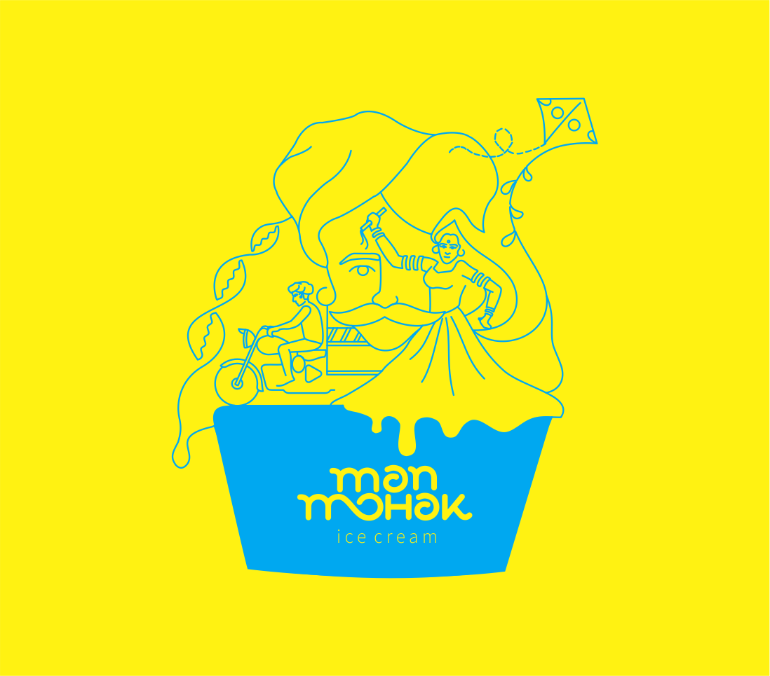
The same line art and theme is used in every packaging we designed for the brand.
This in turn gave the brand a visual branding language that is very similar throughout and
gives out a sense of trust & purity. This line art is so flexible and
media friendly that it can be used on any platform or material and look stunning.
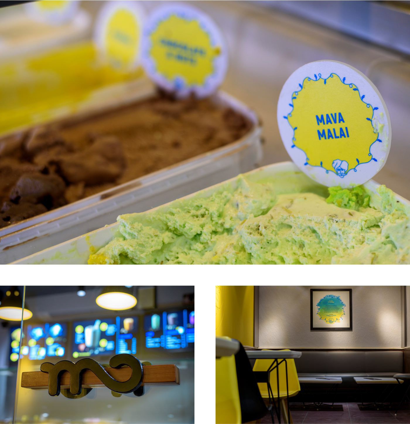
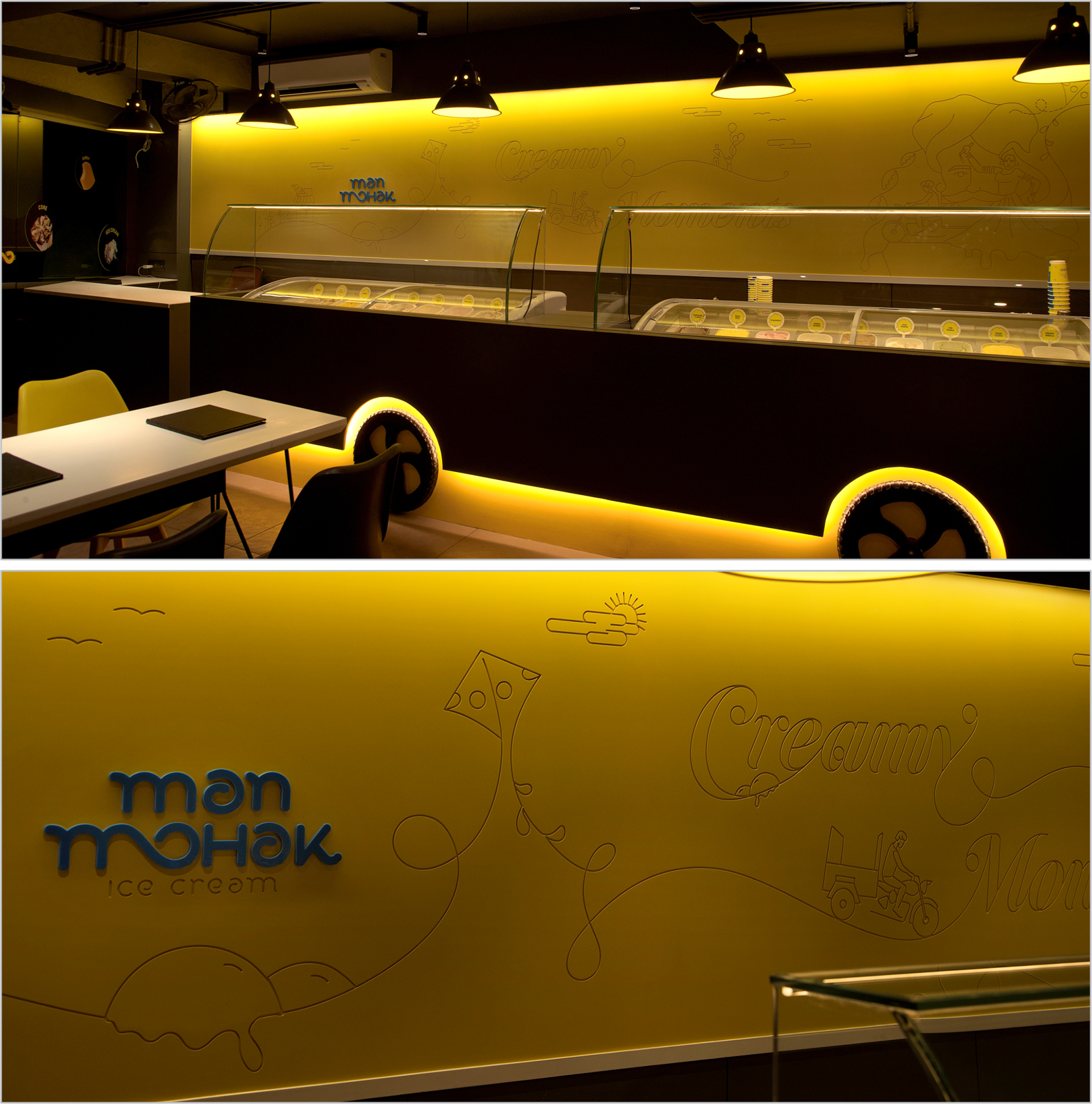
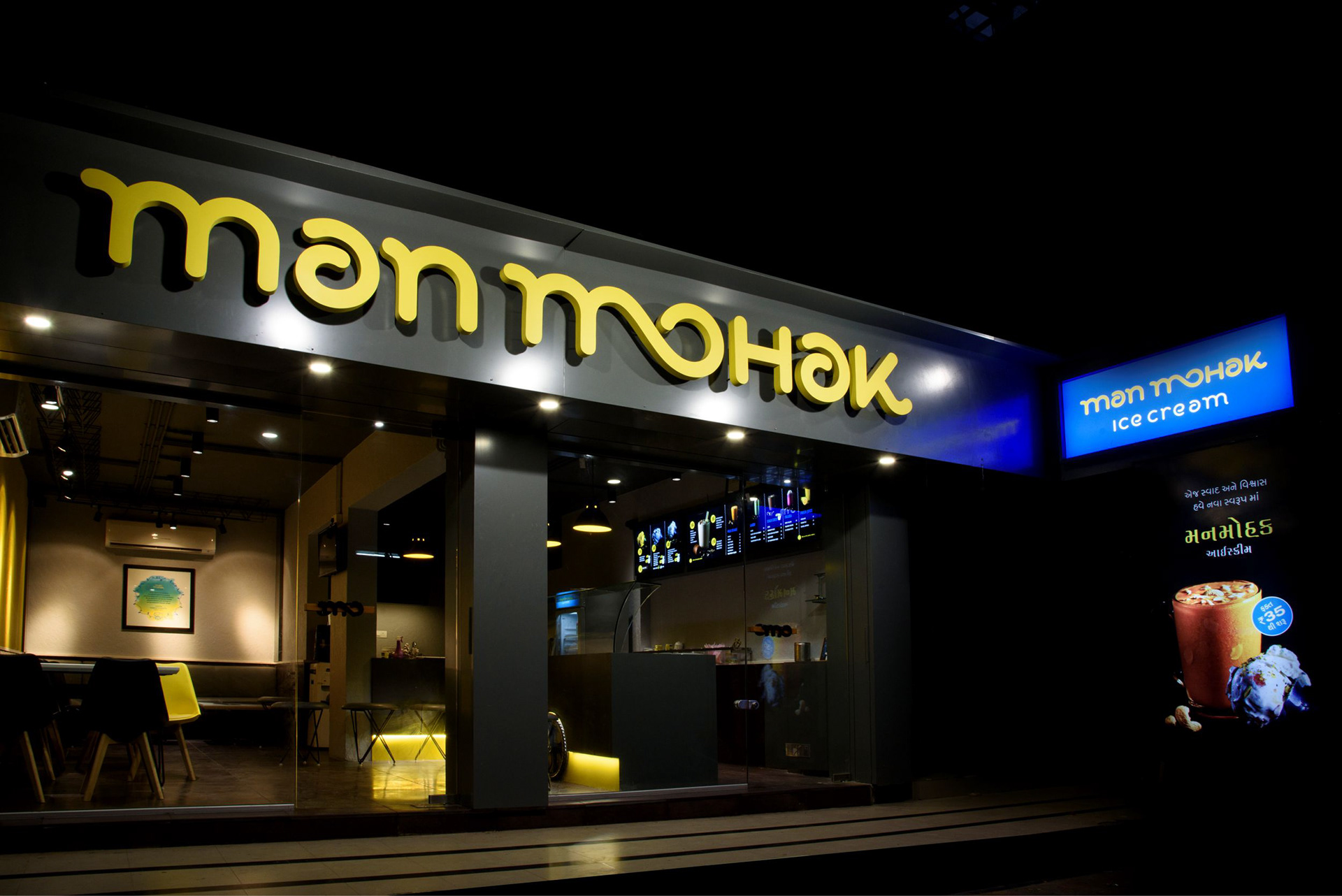
The completely YELLOW WALL of the parlour is adorned with the line art we created and
it gives the space a modernised and trendy look. By engraving this line work on wood and
playing with lights we gave this wall a “movie set” like look.