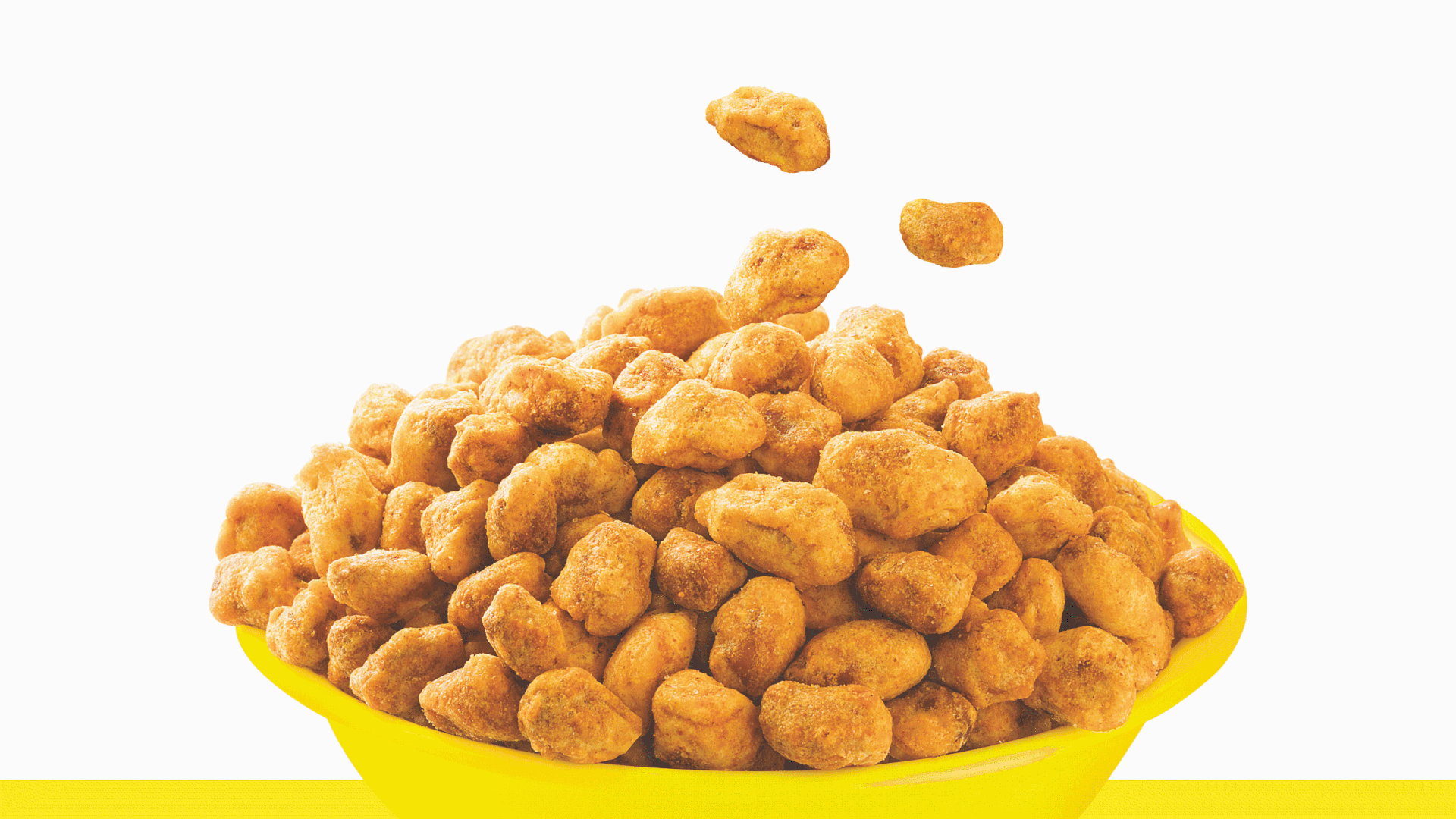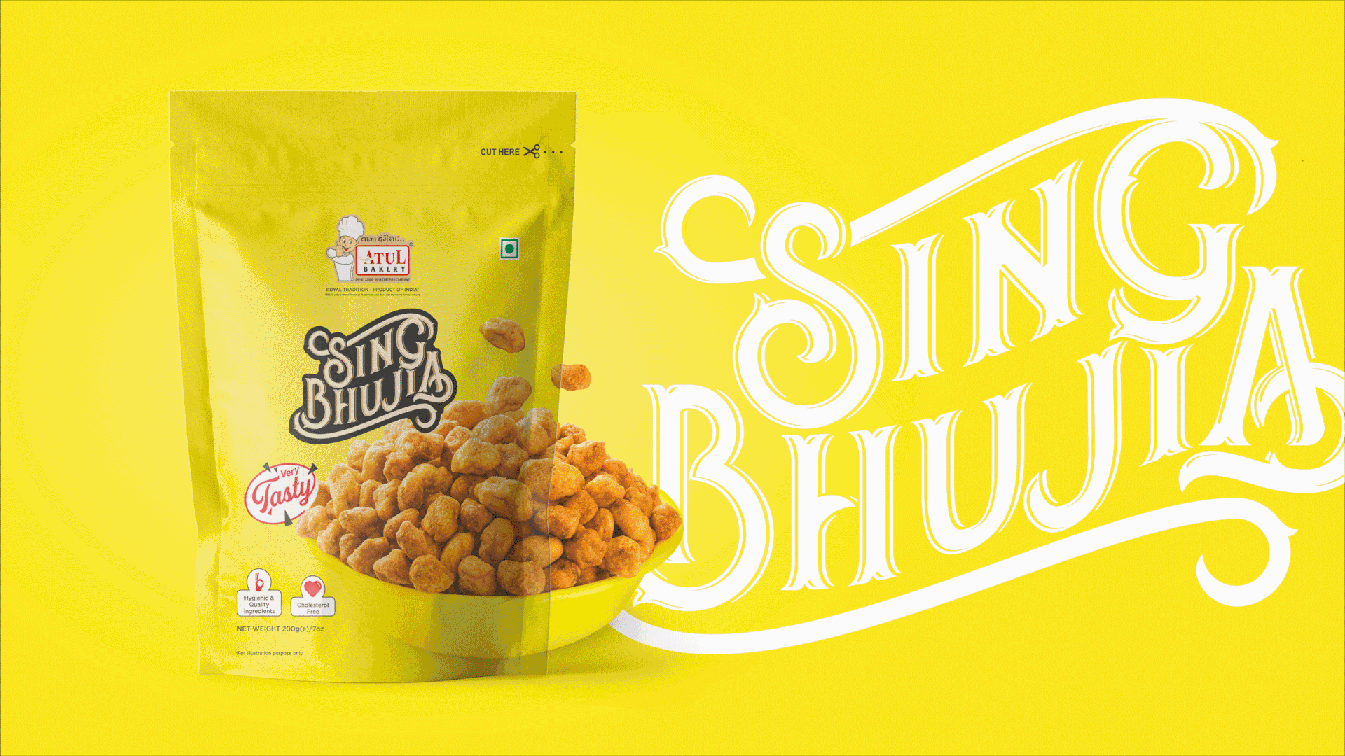
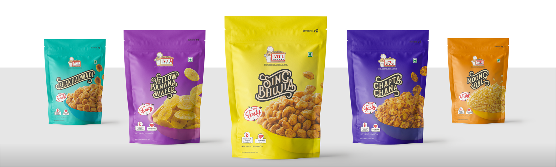
Surat’s famous branded snacks deserved to become the talk of the town. To make the product category seem more aesthetically attractive, we introduced new and vibrant colours. The typeface was created specifically to provide a distinct identity. In photography, hard key light is utilised to capture the beauty of depth and texture. Crockery and backdrop are printed with the same pantone to draw the customer's attention to the product in the pack.